Osteoxfit
A clearer path from pain to strength.
Osteoxfit is a women-only osteopathy and fitness practice in Chelsea. We created an identity and website that makes a broad, personal service simple to understand and reassuring to begin.
- For Amina Shamsi, M.Ost
- Chelsea, London
- Strategy, words, design and development
Care this personal needed a website to match.
People rarely arrive at an osteopath feeling certain. Something hurts, movement has become difficult, or they know they want to feel stronger but do not know where to begin.
Osteoxfit also reaches beyond treatment. Amina’s practice brings osteopathy, massage, rehabilitation and strength coaching together. The website had to make that breadth feel useful rather than complicated, without asking visitors to diagnose themselves or work through a catalogue of services.
The priority was not to say everything at once. It was to help each visitor recognise their situation, understand Amina’s approach and feel confident enough to get in touch.
Begin with why they came.
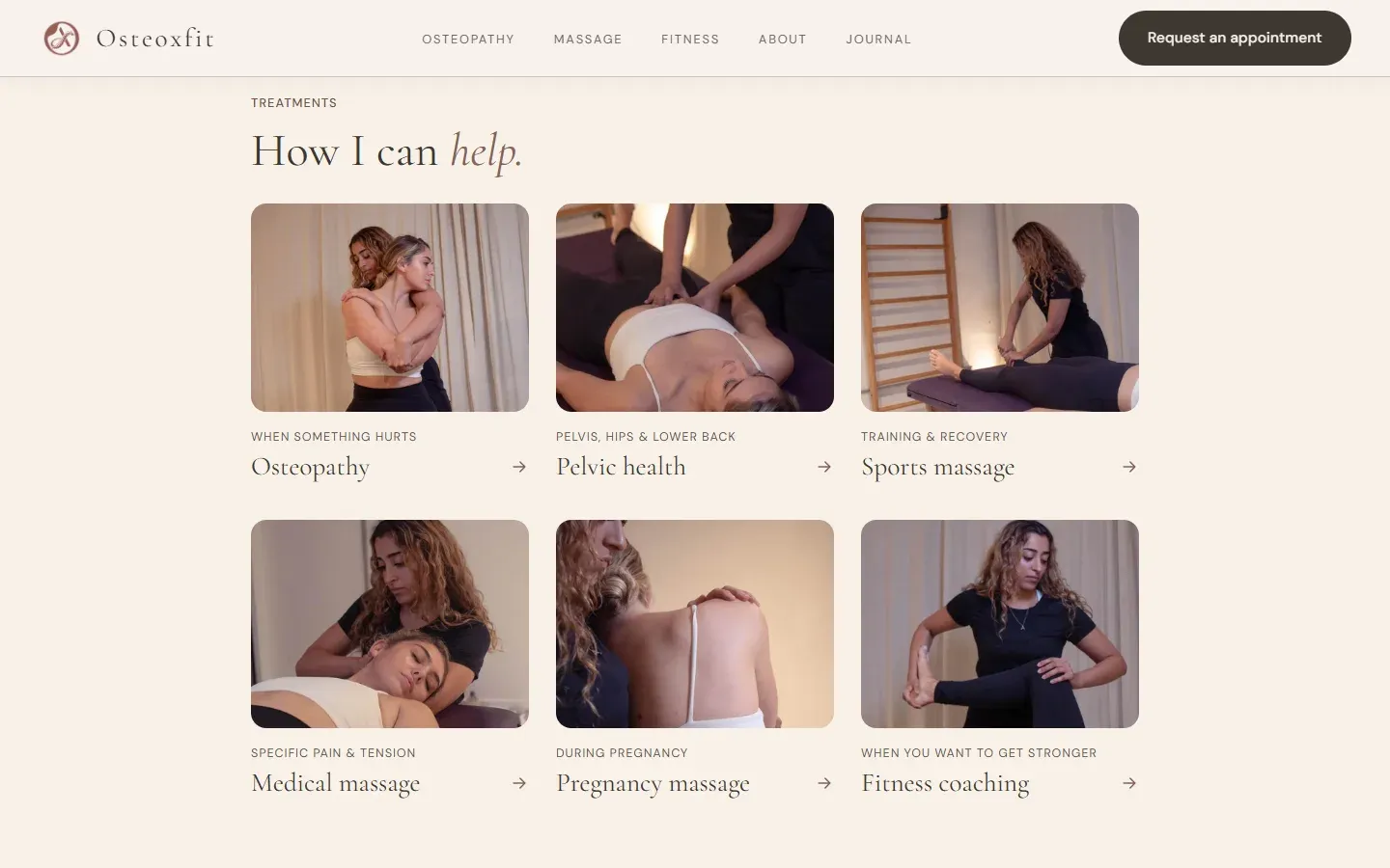
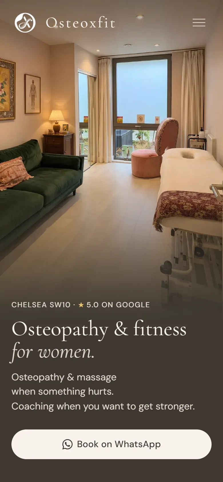
We organised the experience around two familiar intentions: something hurts, or I want to get stronger. That gave visitors a human starting point before introducing professional service names.
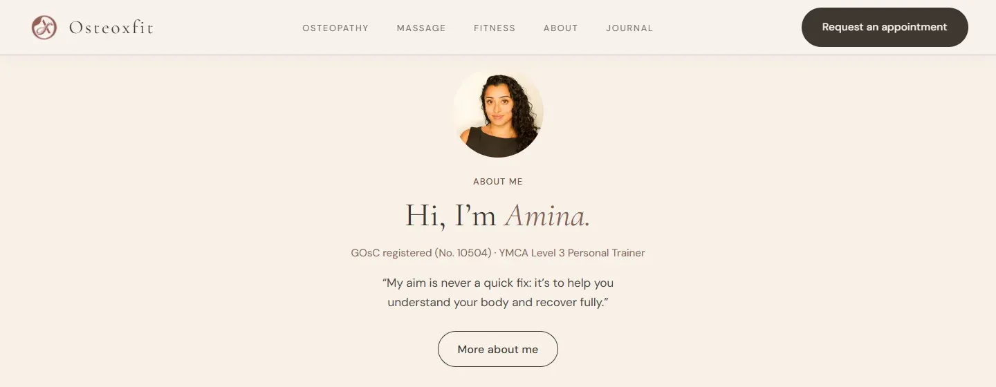
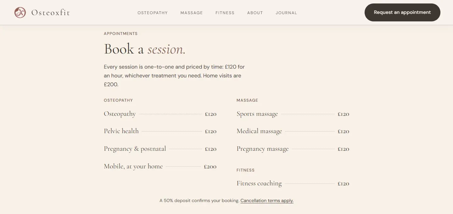
The facts that shape a decision appear early. Osteoxfit is exclusively for women. Amina is a registered osteopath and qualified personal trainer. The practice is in Chelsea, with home visits available. Sessions, prices and the next step are stated plainly.
Each piece of information arrives when it can answer a real question, not simply because there is space to fill.
The work improved by becoming quieter.
Early revisions tried to give every part of the practice equal weight. The result was technically complete but harder to absorb. Too many labels competed for attention, important decisions were buried and the page explained more than a first-time visitor needed.
We reviewed each version from the visitor’s point of view. What do I need to know now? What can wait? What would make me hesitate?
That process led to shorter copy, clearer headings, simpler service groupings, visible pricing and direct routes to booking. Nothing important disappeared. It was given a more useful place.
Clinical confidence, without clinical coldness.
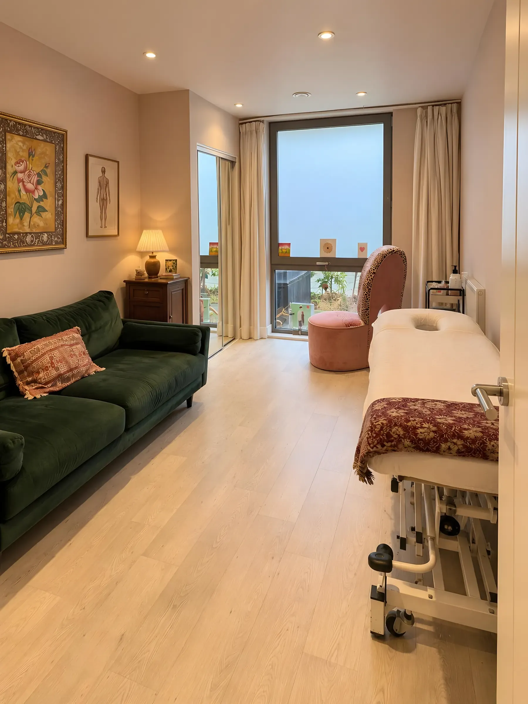
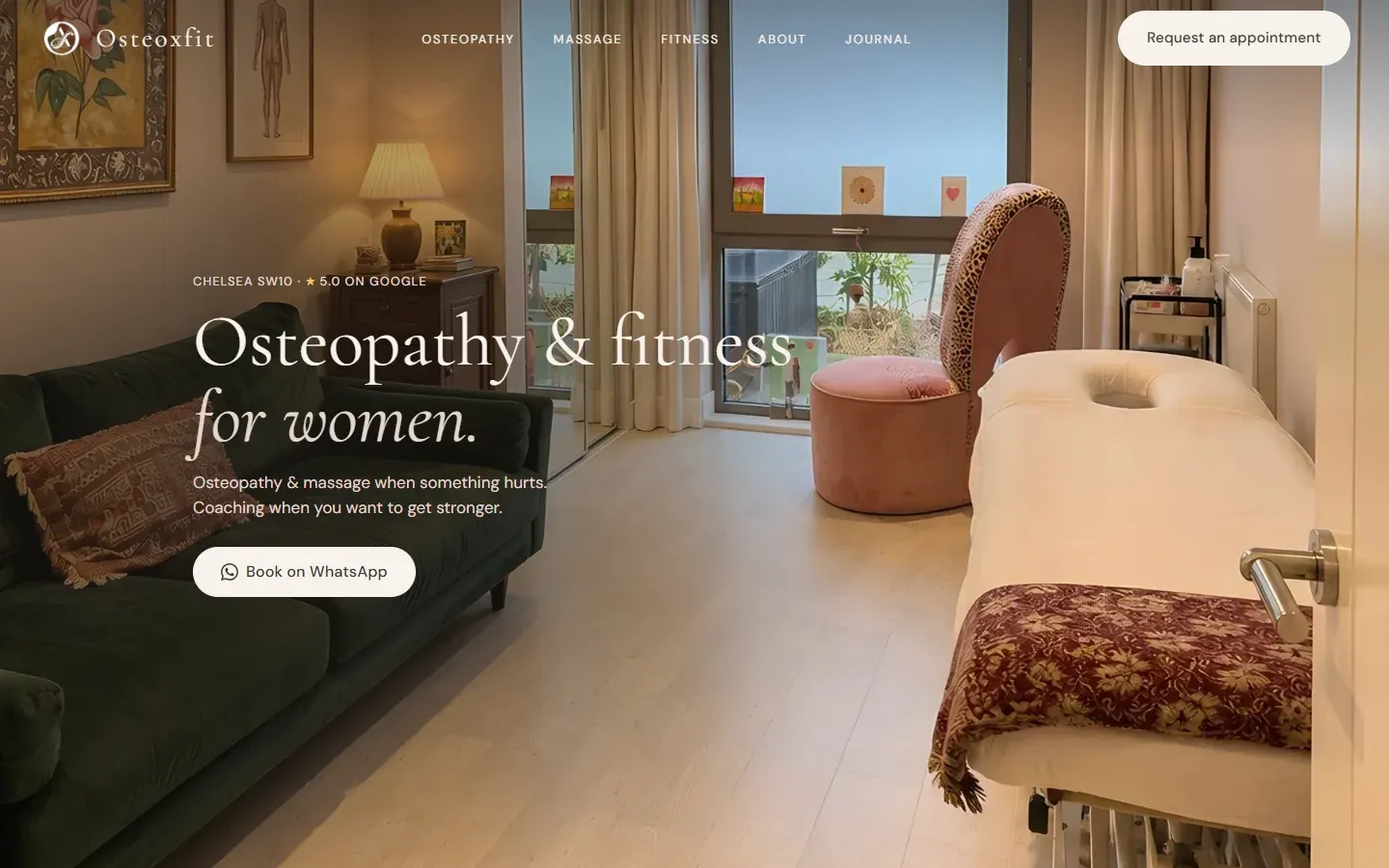
The visual language began with the practice itself. Deep green, muted rose, warm neutrals and natural light make the website feel connected to Amina’s treatment room rather than to a generic medical template.
Editorial typography brings calm authority to the larger ideas. A restrained sans serif keeps services, credentials, prices and practical information easy to scan. Generous space slows the experience down without making it vague.
The writing follows the same principle. It is direct, personal and grounded in the way clients actually describe what they are feeling. Clinical knowledge is present, but jargon never becomes a barrier.
A visitor should not need to understand osteopathy before they can understand whether Osteoxfit is for them.
Sonder took the time to understand not only what we do, but what our clients need to feel before they get in touch. The result is a website that feels unmistakably ours: clear, considered and genuinely easy to use. Every detail has a purpose, and the whole experience gives people confidence in us before we have even spoken.
Built for the questions that come next.
The homepage gives the practice a clear centre, but it does not have to carry everything. Dedicated pages explain individual treatments, women’s osteopathy, pregnancy care, massage, home visits and rehabilitation coaching in greater depth.
A journal gives Amina space to answer the questions she hears in practice and build a useful body of guidance over time. The structure supports search visibility without turning the homepage into a wall of keywords.
The result is a website that can keep growing without losing its sense of calm.
A conversation before the conversation.
The finished website introduces Amina as both a person and a practitioner. It helps visitors recognise what they need, understand what an appointment involves and see exactly how to take the next step.
It does not rely on medical knowledge, exaggerated promises or aggressive booking language. It creates confidence by being clear.
Visit Osteoxfit